
Contributed by: filbert Sunday, July 12 2009 @ 02:10 PM CST
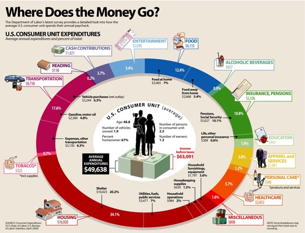 |
A larger version is viewable at the above link.
Being a semi-loyal Dave Ramsey[*2] listener, I had one immediate observation: Where is “debt service” on the chart? I don’t see it.
Still, here’s how it breaks down, in chart form, from largest to smallest percentage:
20.2% Shelter
17.6% Gasoline, motor oil
10.1% Pensions, Social Security
7.0% Food at home
7.0% Utilities, fuels, public services
6.5% Vehicle purchases (“net outlay”)
6.3% Transportation expenses-“other transportation”
5.7% Health care
5.4% Entertainment
5.4% Food away from home
3.8% Apparel and services
3.7% Cash contributions
3.6% Household furnishings, equipment
2.0% Household operations
1.9% Education
1.6% Miscellaneous
1.3% Housekeeping supplies
1.2% Personal care (products & services)
0.9% Alcoholic beverages
0.7% Tobacco and supplies
0.6% Life, other personal insurance
0.2% Reading
Another odd omission is . . . taxes. Apparently, to the Visual Economics people, taxes and debt service (i.e. interest) aren’t household expenses. Well, isn’t that nice to know? Also, going to the source–the Bureau of Labor Statistics, the data are from 2007, NOT April, 2009. And, while debt service isn’t broken out in the BLS data, taxes paid are, which makes it a fairly egregious omission from the chart, in my humble opinion.
Burrowing further into the BLS stats, here’s where the average family’s money comes from:
All Income$63,091
79.76% Wages and Salaries
10.11% Social Security, private and government retirement
5.46% Self-employment income
2.77% Interest, dividends, rental income, other property income
0.34% Unemployment and worker’s compensation, veteran’s benefits
0.53% Public assistance, supplemental security income, food stamps
0.73% Regular contributions for support
0.30% Other income
And, finally, how much of that $63,000 goes to taxes?
3.54% Personal taxes
2.49% Federal only
1.05% State, local, and other
Of course, if you’re actually making $63,000, you’re paying a LOT more than 3.54% of your gross income ($1,569 a year) in Federal taxes, aren’t you? I seem to recall my federal tax, back in the day when I was in that approximate income class, was closer to $5k a year. Ah, the wonder of averaging the tax bill over the entire population–where nearly half of everyone doesn’t pay a single cent. So, one way to think of it is, if you’re that $63,000 person, any Federal tax over $1,569 that you’re paying, is pulling the load for someone else who isn’t. And, the beauty of a “progressive” income tax is, the more you make, the more freeloaders–oops–unfortunate poor people–oops–your saintly fellow citizens you get to subsidize. This is called “fair.” Parenthetically, I’m not sure how this figure of 3.54% squares with the proposals to replace the Federal income tax with an 18% “flat” tax–the so-called “Fair Tax.” Something is seriously screwy with this number, I think, but I might just not quite comprehend what I’m looking at. Wouldn’t be the first time.
Anyway, while I don’t think this graphics rates a full FAIL, it is not completely chock-full of WIN either.