Contributed by: filbert Sunday, July 26 2009 @ 11:07 AM CST
How many Americans living today have never had the opportunity to watch a man walk on the Moon?
News. Sports. Fun. Life

Contributed by: filbert Sunday, July 26 2009 @ 11:07 AM CST
Contributed by: filbert Tuesday, July 21 2009 @ 07:39 PM CST
It doesn’t say much for a “reform” plan when the example used to promote it explicitly warns against it. But that’s what happened when the Mayo Clinic on Tuesday refuted the Obama administration’s sales pitch for a 1,018-page health care reform bill, promising everyone a Mayo-like program.
The clinic warned the proposed reforms won’t create anything like the low-cost system for which Mayo is envied worldwide.
“The proposed legislation,” Mayo says on its policy blog, “misses the opportunity to help create higher-quality, more affordable health care for patients. In fact, it will do the opposite.
Here’s the link[*2] direct from the Mayo Clinic.
Obamacare. Do Not Want.
Contributed by: filbert Monday, July 20 2009 @ 07:27 AM CST
Do you think I exaggerate? That perhaps I’m just a gaijin big white barbarian?
Oh, no, my friends, oh, no.
Via Fark.com[*1] and, apparently, the Russians at Fishki.net, I present this gallery of epic strangeness from the Land of the Rising Sun.[*2] Keep scrolling, it gets weirder and weirder. OK, it just gets weird fast and stays there. A few of the pictures are NSFW and might be offensive if you’re really tightly wound.
Like I said, I love Japan.
Contributed by: filbert Friday, July 17 2009 @ 08:20 AM CST
Contributed by: filbert Wednesday, July 15 2009 @ 08:24 AM CST
“In a nutshell, theoretical models cannot explain what we observe in the geological record,” said oceanographer Gerald Dickens, a co-author of the study and professor of Earth science at Rice University. “There appears to be something fundamentally wrong with the way temperature and carbon are linked in climate models.”. . . The conclusion, Dickens said, is that something other than carbon dioxide caused much of the heating during the PETM (the Palaeocene-Eocene Thermal Maximum–an unusually warm period, much warmer than present day, about 55 million years ago). “Some feedback loop or other processes that aren’t accounted for in these models — the same ones used by the IPCC for current best estimates of 21st Century warming — caused a substantial portion of the warming that occurred during the PETM.”
The models are broken. They can’t explain known conditions in the past. This makes their predictive “skill” regarding future climatic conditions utterly nonexistent.
Why then are we betting the entire world economy on bad computer models?
Contributed by: filbert Monday, July 13 2009 @ 01:04 PM CST
And I suspect at this point, that given the behavior of not only the current incumbent but several of the previous occupiers of that position, that this proposition would receive widespread, bi-partisan support.
Contributed by: filbert Monday, July 13 2009 @ 08:53 AM CST
I posted previously on this here.
In the Boston Globe[*1] , law professor Jonathan Adler confirms what we already knew about the Waxman-Markley climate change/economy destruction bill:
“When Waxman-Markey finally hit the floor, there was no actual bill. Not one single copy of the full legislation that would, hours later, be subject to a final vote was available to members of the House. The text made available to some members of Congress still had ‘placeholders’ – blank provisions to be filled in by subsequent language.’’
Malfeasance in office[*2] :
Nevertheless a few “elements” can be distilled from those cases. First, malfeasance in office requires an affirmative act or omission. Second, the act must have been done in an official capacity—under the color of office. Finally, that that act somehow interferes with the performance of official duties—though some debate remains about “whose official” duties.
I think that any lawmaker (not his or her staff, but the lawmaker in his own person, who has been duly elected to office) who fails to read the content of the bill they are voting for has satisfied all three of these criteria. Therefore, I hold that every single Representative who voted for this non-bill has committed malfeasance in office and should be immediately removed from office by the most direct lawful means necessary.
Oh, and no, I wouldn’t lose any sleep over those Congresscritters losing their office who voted through the rammed-through Patriot Act, either. Once is a mistake, twice is policy.
Contributed by: filbert Sunday, July 12 2009 @ 02:10 PM CST
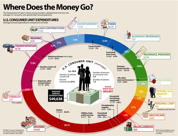 |
A larger version is viewable at the above link.
Being a semi-loyal Dave Ramsey[*2] listener, I had one immediate observation: Where is “debt service” on the chart? I don’t see it.
Still, here’s how it breaks down, in chart form, from largest to smallest percentage:
20.2% Shelter
17.6% Gasoline, motor oil
10.1% Pensions, Social Security
7.0% Food at home
7.0% Utilities, fuels, public services
6.5% Vehicle purchases (“net outlay”)
6.3% Transportation expenses-“other transportation”
5.7% Health care
5.4% Entertainment
5.4% Food away from home
3.8% Apparel and services
3.7% Cash contributions
3.6% Household furnishings, equipment
2.0% Household operations
1.9% Education
1.6% Miscellaneous
1.3% Housekeeping supplies
1.2% Personal care (products & services)
0.9% Alcoholic beverages
0.7% Tobacco and supplies
0.6% Life, other personal insurance
0.2% Reading
Another odd omission is . . . taxes. Apparently, to the Visual Economics people, taxes and debt service (i.e. interest) aren’t household expenses. Well, isn’t that nice to know? Also, going to the source–the Bureau of Labor Statistics, the data are from 2007, NOT April, 2009. And, while debt service isn’t broken out in the BLS data, taxes paid are, which makes it a fairly egregious omission from the chart, in my humble opinion.
Burrowing further into the BLS stats, here’s where the average family’s money comes from:
All Income$63,091
79.76% Wages and Salaries
10.11% Social Security, private and government retirement
5.46% Self-employment income
2.77% Interest, dividends, rental income, other property income
0.34% Unemployment and worker’s compensation, veteran’s benefits
0.53% Public assistance, supplemental security income, food stamps
0.73% Regular contributions for support
0.30% Other income
And, finally, how much of that $63,000 goes to taxes?
3.54% Personal taxes
2.49% Federal only
1.05% State, local, and other
Of course, if you’re actually making $63,000, you’re paying a LOT more than 3.54% of your gross income ($1,569 a year) in Federal taxes, aren’t you? I seem to recall my federal tax, back in the day when I was in that approximate income class, was closer to $5k a year. Ah, the wonder of averaging the tax bill over the entire population–where nearly half of everyone doesn’t pay a single cent. So, one way to think of it is, if you’re that $63,000 person, any Federal tax over $1,569 that you’re paying, is pulling the load for someone else who isn’t. And, the beauty of a “progressive” income tax is, the more you make, the more freeloaders–oops–unfortunate poor people–oops–your saintly fellow citizens you get to subsidize. This is called “fair.” Parenthetically, I’m not sure how this figure of 3.54% squares with the proposals to replace the Federal income tax with an 18% “flat” tax–the so-called “Fair Tax.” Something is seriously screwy with this number, I think, but I might just not quite comprehend what I’m looking at. Wouldn’t be the first time.
Anyway, while I don’t think this graphics rates a full FAIL, it is not completely chock-full of WIN either.